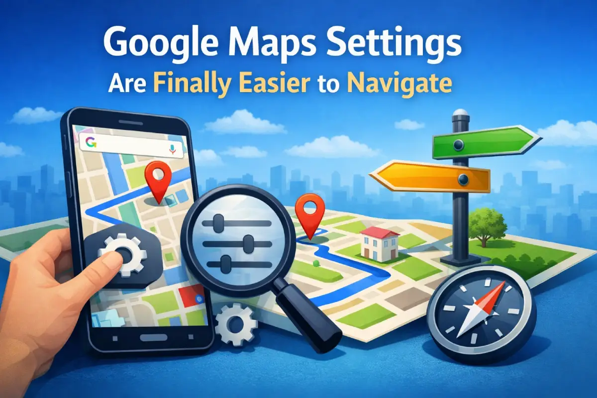
Google has begun introducing a fresh Settings page for Google Maps, enhancing the experience in an area of the app that felt a little crowded. Instead of bringing in major new features, the update is all about smarter organization and smoother navigation making it easier to find what you’re looking for.
Earlier, Google Maps’ settings were shown as a lengthy list needing excessive scrolling. Thanks to the redesign, options now appear in clear groupings making it simpler to locate exactly what you’re after. As well as this improved organization, each section has been given its own name for easier reference. For example, there are categories like “App & Display,” “Navigation,” “Your Vehicles,” “Location & Privacy,” “Offline Maps,” “Notifications,” and “About & Terms.”
In addition to looking different, Google made some changes that affect how things work. One example is the sign-out option: Whereas it used to be hidden away down the bottom of the Settings page, now it’s more visible and easier to get at. Also gone is the familiar back arrow– in its place, a close (X) button lets users exit the Settings screen more quickly.
Although the new design makes things easier to use, it doesn’t change the core features or settings much. Most options are just rearranged into more sensible groups– so existing users will still feel at home, and newcomers won’t get lost.
Both Android and iOS users are seeing the updated Settings page through a server-side update that is gradually rolling out. This means not everyone will see the new layout with its more modern look straight away– though eventually all users will!
The overall redesign tackles an old usability problem with Google Maps, making routine tweaks– like changing your navigation preferences or privacy settings, quicker and more intuitive.